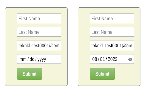
You may not have thought about it, but native HTML date fields — <input type="date"> — don’t support custom placeholder text. They either display a date pattern by default (left image) or a formatted date value (right image)[1]:
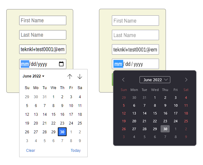
Each browser has its own picker style (Chrome on the left, Firefox on the right):
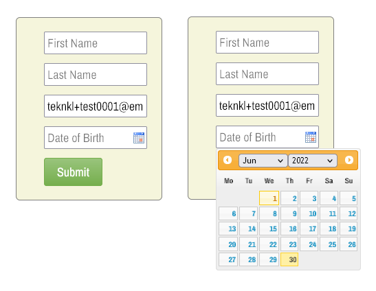
The problem with this behavior is that when your form doesn’t have visible labels, as with the form above, placeholders are the only way people know what they’re filling in. How else would you know the 4th field is Date of Birth, right?
The only way to get placeholders is to eschew true <input type="date"> and instead use <input type="text"> enhanced with a non-native datepicker library.
This isn’t something I would typically recommend, since it’s great that Marketo forms use native <input> types when they can. But Marketo Forms 2.0 has a 3rd-party library built in: it’s the way datepickers are rendered in old browsers that don’t natively support ’em. (Marketo forms are luckily still compatible with Internet Explorer, and even Firefox took ages to support type="date" due to some standards squabbles.)
So you need to make Forms 2.0 think the browser doesn’t support the native type. It’ll then activate the polyfill, and you can set the placeholder text:
MktoForms2.Modernizr.inputtypes.date = false;
MktoForms2.$("body").on("mkto_date_polyfilled", function(e) {
   let dateFields = [
      {
         name : "DateofBirth",
         placeholder : "Date of Birth"
      }
   ];

   /* NO NEED TO TOUCH BELOW THIS LINE */

   MktoForms2.whenReady(function(form) {
      let formEl = form.getFormElem()[0];

      dateFields.forEach(function(fieldDesc){
         let input = formEl.querySelector("[id='" + fieldDesc.name + "']"),
             inputJq = MktoForms2.$(input),
             picker = formEl.querySelector("[id='" + fieldDesc.name + "'] ~ .mktoDateButton");

         input.type = "text";
         input.placeholder = fieldDesc.placeholder;
         picker.style.height = inputJq.outerHeight() + "px";
      });
   });
});
That’ll give you a placeholder, plus the same picker style across browsers:
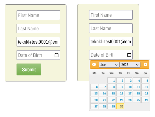
Yes, the default calendar icon is debatably ugly, but you can replace it with the minimalist icon used by Chrome and Safari (yes, it’s open source):
.mktoForm .mktoDateButton {
   display: inline;
   position: absolute;
   cursor: pointer;
   background: url(data:image/svg+xml;base64,PHN2ZyB4bWxucz0iaHR0cDovL3d3dy53My5vcmcvMjAwMC9zdmciIHdpZHRoPSIxNiIgaGVpZ2h0PSIxNSIgdmlld0JveD0iMCAwIDI0IDI0Ij48cGF0aCBmaWxsPSJXaW5kb3dUZXh0IiBkPSJNMjAgM2gtMVYxaC0ydjJIN1YxSDV2Mkg0Yy0xLjEgMC0yIC45LTIgMnYxNmMwIDEuMS45IDIgMiAyaDE2YzEuMSAwIDItLjkgMi0yVjVjMC0xLjEtLjktMi0yLTJ6bTAgMThINFY4aDE2djEzeiIvPjxwYXRoIGZpbGw9Im5vbmUiIGQ9Ik0wIDBoMjR2MjRIMHoiLz48L3N2Zz4=) center center no-repeat;
}
Then it looks like so:
You can also style the picker itself, but I’ll leave that as an exercise for the reader. ☺
Are placeholder-only forms a good idea overall?
Mustn’t skip over the question of whether hiding labels and using only placeholders is a good idea in general. Doubt you’ll find every argument in this Smashing article compelling, but a few points will hit home.
Note from an accessibility standpoint, there is a difference between merely hiding labels — as you usually do with Marketo forms, since they’re in the DOM by default — and not having labels at all.
Notes
[1] The value of a date field is stored in ISO yyyy-MM-dd format, but the pattern or date is displayed in the browser locale, which is kind of confusing in its own right.