Subject lines are still, after all these years, plain text.
But “plain” doesn’t mean “just A to Z.” You can use the tens of thousands of characters and symbols that comprise the world’s languages. You can compose crazy permutations using Unicode accents, marks and decorators. And of course Subjects can include Emojis (long as they’re encoded correctly).
“Plain” just means they can’t include HTML.
Because so much is possible in plain text, acknowledging that some effects are still impossible — they can only be done with HTML & CSS — is a tough call. You feel like you’ve given up early.
Some continue to believe a ® symbol can be forced into superscript, if you can just figure out the syntax. But no, it can’t be done. Let’s explore why.
Diacritics are awesome
The reason people are overly hopeful is that Unicode combining diacritics can indeed do impressive things.
For example, here’s a capital R followed by a combining plus sign below which is rendered as a single custom symbol:
And here’s a capital R followed by a combining overline, a combining low line, and a combining circumflex below for good measure, which all get combined into one symbol:
Cool stuff. And doesn’t take any HTML or CSS to make it work, as it’s plain text.
But that leads people to think you can also change the vertical position of the R itself. Nope. You can decorate a letter with all manner of crazy combining marks (people do this on Twitter to be glitchy or whatever) but you can’t move it up or down. There’s no such thing as a “combining superscript” character or anything like that.
So you’re at the mercy of the specific font the mail client chooses to display Subject lines.
Which might still work in most fonts if the Registered Sign character were defined or suggested as a superscript character in the Unicode standard. But it’s not.
Let’s check the code charts
Compare the official Unicode code chart entry for the Trade Mark Sign[1]:

With the entry for the Registered Sign:

What should be immediately clear is that the Trade Mark Sign specifically refers to a <super> (i.e. superscript) Capital T and Capital M while the Registered Sign only refers to a Capital R in a circle.[2]
Even in the sample glyph used in the standard, you can see ™ is supered but ® is not.
That doesn’t mean that ® can’t be a natural superscript in certain fonts, if they so choose. In fact, this whole blog post is displayed in Source Serif Pro, whose ® is supered! (I don’t have to wrap it in an HTML <sup> or use CSS vertical-align to get the effect.)
But given that the official reference style is not in superscript, the majority of standard fonts will not render in superscript. And since we have no control over what font a mail client will choose for plain text, we can’t guarantee anything.
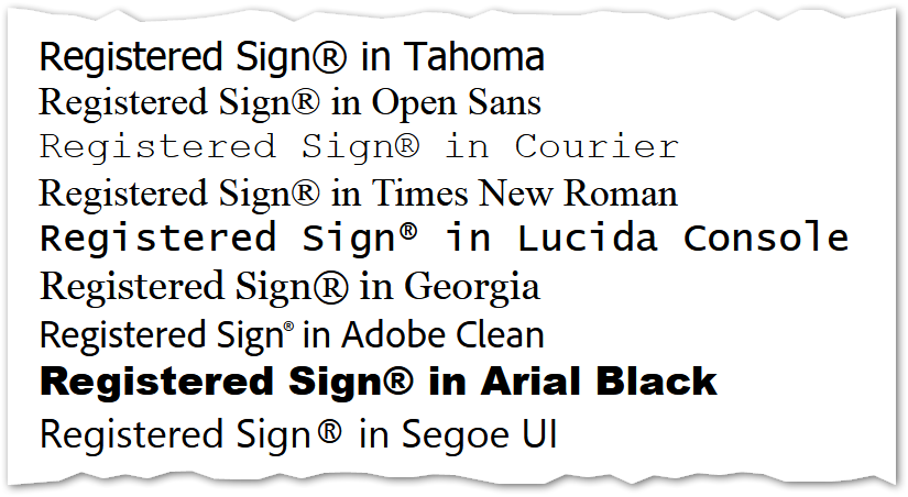
Check this comparison across common fonts:

Clearly a mixed bag and you can’t expect a superscript ® across clients, devices, etc.
The Emojified variant️ won’t help
If you’re not confused enough by Unicode, some old-school characters can have both Text and Emoji versions. You signal that the Emoji variation is preferred by putting a special character called Variation Selector-16 directly after the main character. (VS-16 is thus like a combining Emojifier.)
If the font and device support it, the Emoji variant can be in color, have a drop shadow, or any other more graphical styles.
The reference style for an Emojified ® is shown here:

So it’s imagined as a dark gray, softer, sans-serif R in a circle — but still not superscript.
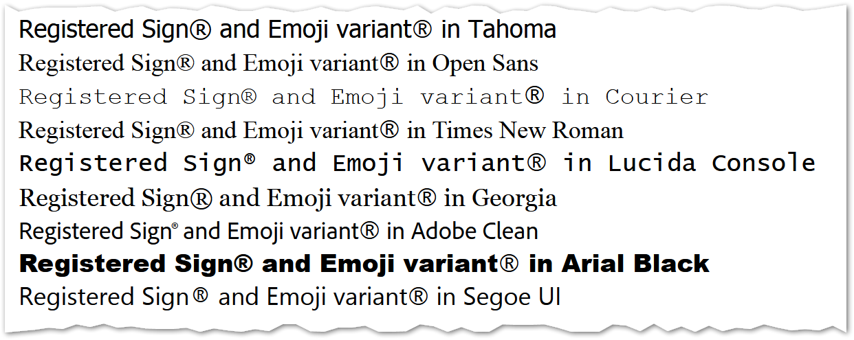
If you compare the real-world Emojified ® (which will be the same in all fonts in an app or device, by design) to each font’s native text ® in my Firefox 80-something on Windows, the Emoji is baseline-aligned...

... and ruins the natural advantage of Lucida Console, Adobe Clean, and Segoe UI, whose text ® is superscript. IMO the only one improved is Georgia, since in that font the text ® sits below the baseline.
So that’s that! Wish I had a mind-blowing trick for you today, but this post is about the need to — sometimes — stay realistic.☺
Notes
[1] In the Unicode Code Charts, the ≈ symbol represents a Compatibility decomposition mapping:

which is defined elsewhere as
Mapping to a roughly equivalent sequence that may differ in style
Since it “may differ in style,” the ™ character doesn’t have to look exactly like a superscript T and M in the same font (that would be a Canonical, not Compatibility, mapping). But TM is the best approximation if a font doesn’t include an actual ™. A custom font could align its ™ to the baseline if it wanted, but that would be a dramatic choice.
In any case, it’s the contrast with the ® character that’s significant. ® is not compatibility-equivalent to a <super>circled latin capital R. It’s merely sort-of-like (cross-reference →) another Unicode character, the pre-circled R from the enclosed alphanumerics block, which also isn’t superscript.
[2] By the way, the “circled Wz” or Warenzeichen symbol is used in Germany for much the same purpose as ™. (Most other countries simply borrow ™ even though it’s technically English.)