Someone bumped an old Nation thread where I’d provided code to add a CSS class to every <label> element indicating the type of input it’s labeling, like:
<label id="LblProductInterest" for="ProductInterest" class="mktoLabel for-type-radio"><label id="LblIndustry" for="Industry" class="mktoLabel for-type-select-one">You can then use generic CSS selectors, i.e. .mktoForm label.for-type-radio. After all, you almost certainly want to style all labels for radio buttons the same way (on a given form). You don’t need to know the field name for that!
That code was bad by my current standards, especially because it didn’t pick up new fields added by Visibility Rules. Also, a data- attribute is a better fit than a class.
Here’s the updated code:
/**
 * Tag labels with type of related input
 * @author Sanford Whiteman
 * @version v2 2021-10-02
 * @copyright © 2021 Sanford Whiteman
 * @license Hippocratic 2.1
 *
 */
MktoForms2.whenRendered(function(mktoForm){
  const arrayify = getSelection.call.bind([].slice);

  let formEl = mktoForm.getFormElem()[0],
      labels = formEl.querySelectorAll("label:not([data-for-type])");

  arrayify(labels)
  .forEach(function(label){
    let relatedInput = formEl.querySelector("#" + label.htmlFor) || formEl.querySelector("[name='" + label.htmlFor + "']");
    label.setAttribute("data-for-type", relatedInput ? relatedInput.type : "");
  });
});
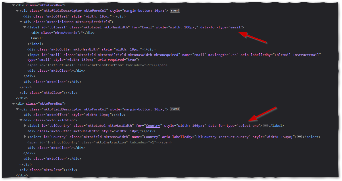
It’ll add data- attributes like so...

... allowing this CSS...
.mktoForm label[data-for-type="text"] {
   color: green;
}
.mktoForm label[data-for-type="email"] {
   color: blueviolet;
}
.mktoForm label[data-for-type="select-one"] {
   color: white;
   background-color: darkred;
   padding: 6px 0;
   text-align: center;
}
.mktoForm label[data-for-type="radio"] {
   color: mediumvioletred;
}
.mktoForm .mktoRadioList label[data-for-type="radio"] {
   color: green;
}
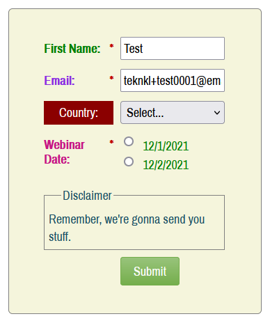
... to create individually styled monstrosities like this:

A rare need perhaps, but you never know what Marketo Forms projects will throw at you.