The epithet “designed by developers” may not be one you've heard. (And that's okay: most people who read this blog have kept up their automatic respect for techies longer than I have.☺)
Developer-Designed UI describes the class of UI fails that can result when the person who wrote an app also creates its public-facing UI.
Such mistakes include:
- interfaces with lots of technical bells and whistles, but crammed into one box, rather than graceful navigation via tabs, accordions, or wizards
- impenetrable labels, reusing coding terms as opposed to business- or user-friendly names (think Execute SQL and Commit Transaction instead of just Save)
- over-aggressive field validation, without explanation (like a textbox that blocks punctuation marks and makes you think your keyboard is broken, instead of noting the business rule)
- under-aggressive validation, based on the “letter” rather than the “spirit” of data (basic
<input type="email">is a great example: it allows the formatuser@unqualifiedhostnamebecause that's technically a valid SMTP address for internal use, but it makes little sense to enter it on a public form) - contradictory widgets, like checkboxes that should be mutually exclusive, but can all be checked at once (a sign that the developer trusts users to choose only one, based on prior knowledge that only the developer actually has!)
- garish decorations like neon-green-on-black text, which are still used by young coders in order to look
1337!
Though the term is pretty well-traveled, it's hard to find real-world examples of it[1] and it's become one of those “you know it when you see it” things. (Plus, the most glaring examples are in-house/intranet apps, and people don't screenshot those for the web unless they want to get fired.)
<Rant On>
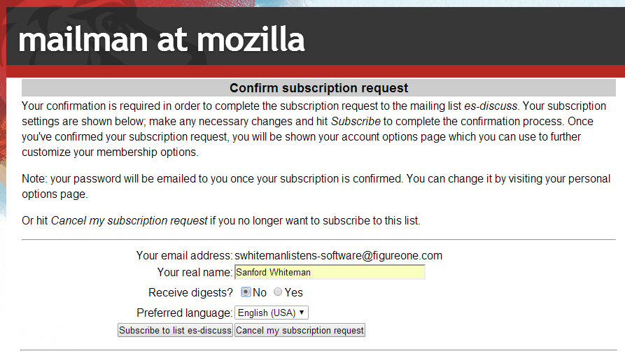
So let me submit Exhibit I.
Bear in mind: this is the mailing list subscription page for one of the most powerful technical standards bodies in the world, TC39 or the ECMAScript/JavaScript group. They literally make the web work. And they are far better developers than I could ever be (anyone who writes languages + compilers is automatically in different realm from any of us plebes).
But just look at this thing. Its suckage is in its simplicity.

Guess what I did the first time I clicked my confirmation URL and got to this page?
Yup, I clicked  by accident. That button is aligned with the form fields above it, so it's naturally emphasized… even though it's surely not, to use our martech term, a Success status.
More whitespace and padding, plus better human alignment, and the form wouldn't be so tragic. As of now, you can only make the neutral statement, “Every function of the software is available in the UI” — faint praise that suggests it's a Developer-Designed UI.[3]
Anyway, I got it “right” after my second signup and confirmation email. But had to rant. In all seriousness, next time you publish a questionably designed marketing form, compare it to this one and feel better!
Notes
[1] Though that Coding Horror post is a top Google hit, I actually don't think that GNU Wget UI is a great example, as a lot of others point out in the comments over there. A better example, and I say this out of love, is the CrushFTP UI. I love this product and have 5 servers running it, and the developer is incredible. But man, parts of that UI are pure developer-designed. (Sorry Ben!)
[2] I'm not a professional UI guy, but I have worked as a graphic designer for what I think is pretty sharp album art. Eh?
[3] Yes, I know this is a page automatically generated by the Mailman mailing list program, thus the real developer of the UI is the Mailman author. Perhaps it's merely a Developer-Approved UI. But that's no excuse, as it could obviously be restyled if you realized how bad it was.