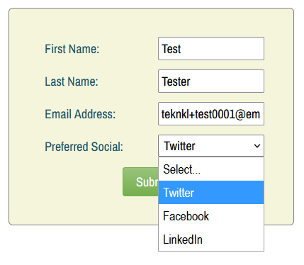
Been playing around this weekend with ddSlick to transform a Marketo Select — that is, a standard HTML <select> —into an “image dropdown.” So you can change this:

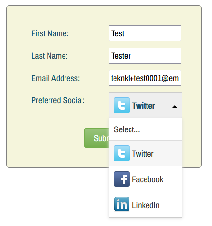
Into this:

Rolling it out
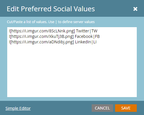
First, add your image URLs in Form Editor, using Markdown syntax* (![url]) at the beginning of each value:

Then include this JS right after the form embed (yes, a few different <script> tags, in this order, are necessary):
<script id="routeJQGlobalToJQMkto">
   window.originalJQuery = window.jQuery;
   window.jQuery = MktoForms2.$;
</script>
<script type="text/javascript" src="https://cdn.rawgit.com/prashantchaudhary/ddslick/master/jquery.ddslick.min.js" ></script>
<script id="restoreJQGlobal">
   delete window.jQuery;
   if(window.originalJQuery){
      window.jQuery = window.originalJQuery;
   }
</script>
<script>
MktoForms2.whenReady(function(mktoForm){

   const fieldsToSlickify = [{
      name : "MktoPersonNotes",
      ddSlickOptions : {},
      desktopOnly: false
   }];

   /* NO NEED TO TOUCH BELOW THIS LINE! */

   const arrayify = getSelection.call.bind([].slice);

   fieldsToSlickify.forEach(function(fieldDesc){

      let formEl = mktoForm.getFormElem()[0],
          selectEl = formEl.querySelector("select[name='" + fieldDesc.name + "']");

      arrayify(selectEl.options)
      .forEach(function(option){
         let imageMatch = option.textContent.match(/^!\[(.*)\](.*)/);
         if(imageMatch) {
           let imageSrc = imageMatch[1],
               nonImageContent = imageMatch[2].trim();

            option.setAttribute("data-imagesrc", imageSrc);
            option.textContent = nonImageContent;
         }
      })

      fieldDesc.ddSlickOptions.width = fieldDesc.ddSlickOptions.width || selectEl.style.width;
      fieldDesc.mktoMobileBreakpoints = fieldDesc.mktoMobileBreakpoints || "(max-width: 480px), (max-height: 480px)";

      let matchesMobileBreakpoint = window.matchMedia(fieldDesc.mktoMobileBreakpoints).matches;

      if( !fieldDesc.desktopOnly || !matchesMobileBreakpoint ) {
        MktoForms2.$(selectEl).ddslick(fieldDesc.ddSlickOptions);
      }

   });

});

</script>
fieldsToSlickify is an array of the fields you want to transform. Optionally, you can populate ddSlickOptions with ddSlick API options such as imagePosition.
To get the above screenshot, I also tweaked the CSS to match my existing custom layout:
div.dd-container {
   float: left;
}
label.dd-selected-text {
   line-height: 32px !important;
}
span.dd-pointer-up {
   top: 40%;
}
Your site may need additional styles.
Word of warning
ddSlick is not the best nor only plugin for this, just a reasonably good-looking one that I came across.
But no matter how awesome it looks on your desktop browser, a so-called “image dropdown” — like any non-HTML-standard form widget — must not be assumed to be accessible or mobile-compatible.
So, fun as it is to play with, I wouldn’t put this in production unless the project is well-funded enough for UX testing across different mobile browsers/OSes.
For this reason, might be best to simply not “ddSlick-ify” Selects if the person is on mobile. Just set desktopOnly to true...
const fieldsToSlickify = [{
      name : "MktoPersonNotes",
      ddSlickOptions : {},
      desktopOnly: true
   }];
... and the standard <select> will be used if the page is under the standard Forms 2.0 breakpoints (i.e. if the height or width is <= 480px).
Notes
* Using Markdown syntax for no particular reason other than it (a) is widely used and (b) is unlikely to naturally appear in Option text.